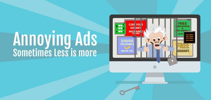
Have you ever been doing research, watching videos on YouTube or attempting to find a new couch on sale, and you discover that with every page you open, there are more and more adds to contend with? It seems that no matter how quickly you click on the life-saving little “X” in the corner (assuming you even have that option), another ad pops up! Why would publishers do this? They flash banners, they play videos (unsolicited), and implement all kinds of overlays that block you from seeing the content you are trying to see.
One of the advertising “facts of life,” which will surprise nobody, is that typically, the more ads a publisher places, the more revenue that can be generated. But is that really the case, or is it possible that in this instance, less is more?
The industry is definitely headed in the right direction. Surveys and statistics reveal that a large percentage of users are accepting of ads, so long as they can get free content that pertains to them and their needs, and that stay out of their way. When the ads become too numerous, and have nothing to do with their particular behaviors, then they tend to get antsy, and with good reason!
Apparently, some publishers are now taking this “more-isn’t-necessarily-better” stance. These publishers are reporting that customers are more willing to stay engaged longer when the distracting ads are reduced to a reasonable number. Not only does this make for a more pleasant experience for the potential customer, it leads to more interactivity. This results in more sales, thereby increasing ad revenue, which increases the ever-so-important bottom line.
A prime example of the success of this concept occurred in 2016, when the publisher, LittleThings, challenged itself to take at least one form of advertising out of the picture each quarter, yet keep the same revenue flow.
Over the next twelve months, the site continued to remove the content recommendation ads that were so inundated with clickbait. They also proceeded to take away the page-covering interstitial ads and the intrusive and uninvited autoplay video ads. Now, the site mostly depends on user-initiated videos, sponsored content and display ads.
Decreasing the number of ads on each page of this site reduced the revenue generated from the individual pages, yet the overall revenue actually increased. In fact, according to LittleThings’ chief digital officer, Justin Festa, “Users view more pages, share more content and are generally more engaged.” He added that the revenue that was generated from the individual users’ sessions increased by 38% in June, compared to the previous year. Fest added, “What’s more, having fewer ads on each page actually helped boost the performance and value of the advertising that remained. The ads were more likely to be seen and clicked on because there was less clutter.”

Revenue aside, publishers are beginning to cut out some of the intrusive and annoying ads (although revenue will never actually be set aside)! This DOES improve the users’ experience, but it could have financial benefits as well, as was just pointed out.
There are some leaders in the industry that say that there has been an increase in the development and use of ad-blocking technology because of the annoying, spammish-type ads. Another possibility is that publishers may be attempting to gain a foot up before Google introduces an imminent, already-in-the-planning new ad filter to its arsenal on its Chrome web browser. This would sort out the autoplay videos, interstitial ads and the other pesky formats that have been loading by default.
When publishers try to squeeze as many ads as possible onto the individual web pages, they may be cutting off their noses to spite their faces! Although, they are starting to recognize that while they may be leaving money on the table by reducing annoying ads, they are simultaneously increasing the enjoyment of the users, which ultimately drives the growth of the brand.
These ad-filled pages have become way more intrusive and crowded over the last few years. These cluttered web page ads have been compared to the busy, disorienting flashing signage in New York’s Time Square. This, in and of itself, begs the question; if these ads are so annoying, why do publishers continue to use them? It’s because in today’s unpredictable advertising market, it’s a source of revenue that’s hard to modify. Many don’t want to “reinvent the wheel,” as it may not work as well.
Nevertheless, when publishers consider the long-term affect that these cluttered ads can have on their sites, they may change their tune.
At the end of the day, it’s becoming more and more evident that it’s not necessary for publishers to depend on these assertive ad-types to keep the lights on. To the contrary. By improving the user experience, potential customers tend to stay around longer, many times taking time to really look at the page they pulled up, and the ads contained therein.


